Developing Diary/HanInBridge React Update
[React 오답노트] Media query를 이용하여 반응형 UI 구현하기
kurooru
2023. 1. 24. 20:28

< 목표 >
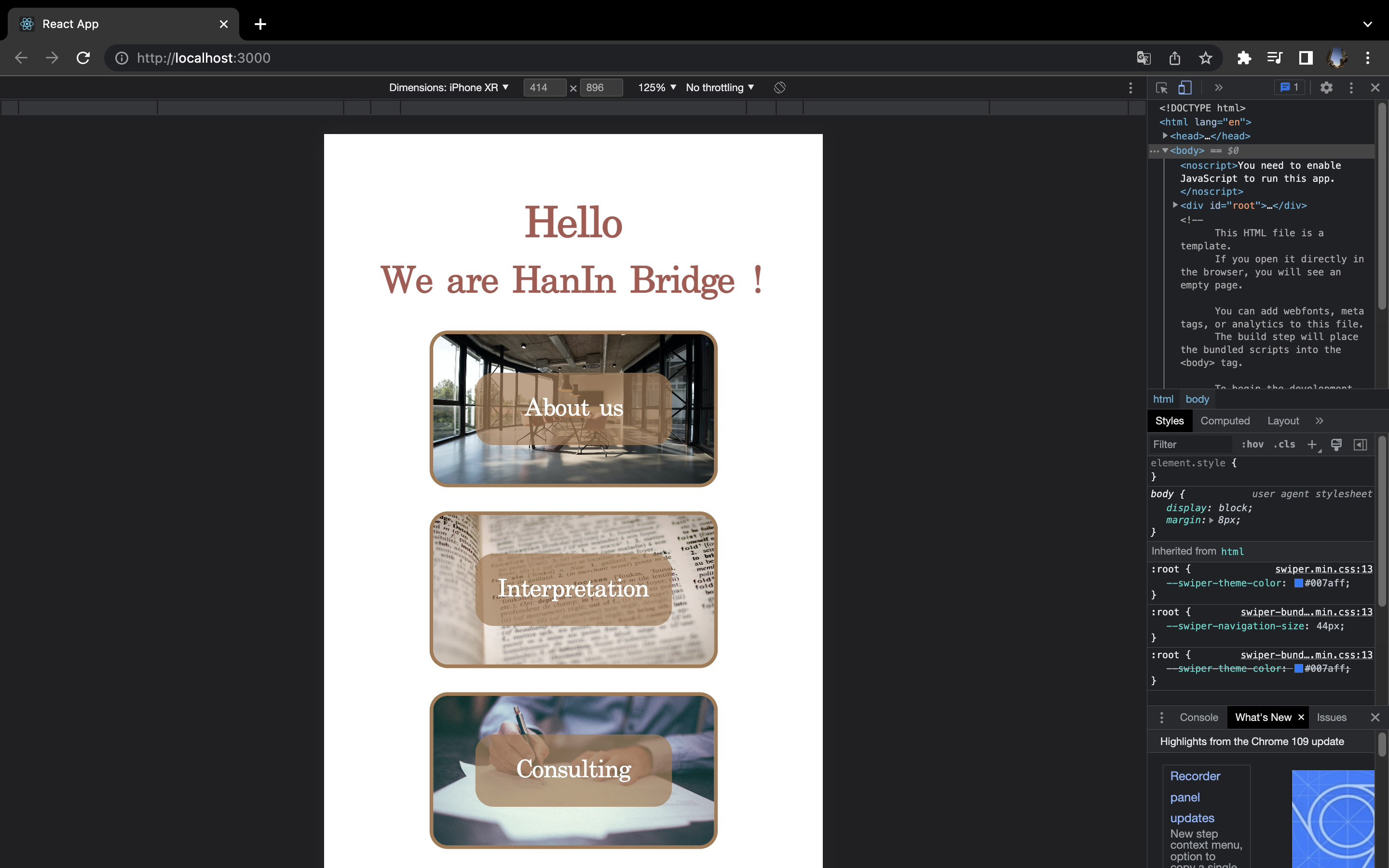
미디어 쿼리와 스타일 컴포넌트를 이용하여 스마트폰과 pc에 다르게 반응하는 UI 구현하기
style.jsx -> style-component 파일
import styled from "styled-components";
import mainImg from "../../resources/images/landing/hello.jpg"
import aboutUsImg from "../../resources/images/landing/aboutUs.jpg";
import interpretationImg from "../../resources/images/landing/interpreation.jpg";
import consultingImg from "../../resources/images/landing/consulting.jpg";
export const FlexDiv = styled.div`
    display: flex;
`;

export const ResUpTitle = styled.h1`
    // for smartphone
    @media only screen and (max-width: 768px){
        margin: 0;
        margin-top: 50px;
        display:inline-block;
        width:100%;
        text-align: center;
        color:#A75951;
        font-size: 35px;
        line-height: 1;
    }

    // for Pc
    display: none;
`

export const ResDownTitle = styled.h1`
    // for smartphone
    @media only screen and (max-width: 768px){
        margin: 0;
        margin-bottom: 10px;
        display:inline-block;
        width:100%;
        text-align: center;
        color:#A75951;
        font-size:30px;
        line-height: 2;
    }
    // for Pc
    display: none;
`
export const Ul = styled.ul`

    // for smartphone
    @media only screen and (max-width: 768px){
        width: 60%;
        margin: 0 auto;
        padding: 0;
    }

    width:20%;
    padding-left: 0;
    padding-top: 50px;
    padding-bottom: 50px;
    margin:0;

    li {
        width:100%;
        margin:0 auto;
        list-style: none;
        display: flex;
        flex-direction: column;
        justify-content: center;
        text-align: center;
        height:130px;
        border: 3px solid #A67951;
        border-radius: 15px;
        box-sizing: border-box;
    }

    li:hover {
        box-shadow: 9px 2px 32px rgba(0,0,0,0.3);
    }

    & li:nth-child(1) {
        margin-bottom: 20px;
        background-image: url(${aboutUsImg});
        background-position: center;
        background-repeat: no-repeat;
        background-size: cover;
    }

    & li:nth-child(2) {
        margin-bottom: 20px;
        background-image: url(${interpretationImg});
        background-position: center;
        background-repeat: no-repeat;
        background-size: cover;
    }

    & li:nth-child(3) {
        background-image: url(${consultingImg});
        background-position: center;
        background-repeat: no-repeat;
        background-size: cover;
    }

    li p {
        margin: 0 auto;
        display: inline-block;
        width: 70%;
        line-height: 3;
        background-color: rgba(166, 121, 81, 0.7);
        color: #fff;
        border-radius: 15px;
        font-family: serif;
        font-size: 20px;
        transition: all 0.7s;
    }

    li p:hover {
        background-color: #000;
        cursor: pointer;
    }

    li p link {
        margin: 0;
        text-decoration: none;
    }
`;

// How to plant background img and make it only opacified
export const ImgContainorDefault = styled.div`

    // for smartphone
    @media only screen and (max-width: 768px){
        display: none;
    }

    display:flex;
    flex-direction: column;
    justify-content: center;
    margin: 0 auto;
    width:70%;
    position: relative;

    &::before{
        content:"";
        background-image: url(${mainImg});
        background-repeat: no-repeat;
        background-size: cover;
        background-position: center;
        opacity: 0.5;
        position: absolute;
        top: 0px;
        left: 0px;
        right: 0px;
        bottom: 0px;
        border-radius: 15px;
    }
`;

export const Title1 = styled.h1`

    margin: 0;
    text-align: center;
    margin-bottom: 30px;
    transform: translateX(-260px);
    color: #000;
    font-family: serif;
    font-size:70px;
`;

export const Title2 = styled.h1`

    margin: 0;
    text-align: center;
    transform: translateX(30px);
    color: #000;
    font-family: serif;
    font-size:70px;
`;

export const LocationAndWeather = styled.p`
    margin: 0;
    text-align: center;
    font-size: 25px;
    line-height: 3;
    font-family: 'Times New Roman', Times, serif;
`
export const ImgContainorAboutus = styled.div`

    display:flex;
    flex-direction: column;
    justify-content: center;
    margin: 0 auto;
    width:70%;
    position:relative;

    &::before{
        content:"";
        background-image: url(${aboutUsImg});
        background-repeat: no-repeat;
        background-size: cover;
        background-position: center;
        opacity: 0.4;
        position: absolute;
        top: 0px;
        left: 0px;
        right: 0px;
        bottom: 0px;
        border-radius: 15px;
    }
`;

export const ImgContainorInterpretation = styled.div`

    display:flex;
    flex-direction: column;
    justify-content: center;
    margin: 0 auto;
    width:70%;
    position:relative;

    &::before{
        content:"";
        background-image: url(${interpretationImg});
        background-repeat: no-repeat;
        background-size: cover;
        background-position: center;
        opacity: 0.4;
        position: absolute;
        top: 0px;
        left: 0px;
        right: 0px;
        bottom: 0px;
        border-radius: 15px;
    }
`;

export const ImgContainorConsulting = styled.div`

    display:flex;
    flex-direction: column;
    justify-content: center;
    margin: 0 auto;
    width:70%;
    position:relative;

    &::before{
        content:"";
        background-image: url(${consultingImg});
        background-repeat: no-repeat;
        background-size: cover;
        background-position: center;
        opacity: 0.6;
        position: absolute;
        top: 0px;
        left: 0px;
        right: 0px;
        bottom: 0px;
        border-radius: 15px;
    }
`;

export const ShortSummary = styled.h1`

    margin: 0;
    margin-right: 80px;
    text-align: right;
    color: #000;
    font-family: serif;
    font-size: 50px;
    /* This stops to be opacitied */
    z-index: 1;
    line-height:1.5;
`;
문제의 발생
미디어 쿼리를 통해 픽셀 수에 반응하는 반응형 UI를 구현하려 했으나,
스타일 컴포넌트에서 이를 어떻게 사용하는지 모르겠었다.
해결방안
@media only screen and (max-width: 768px){
}
을 이용하여 해결할 수 있었다.
해결 코드
export const ResUpTitle = styled.h1`
    // for smartphone
    @media only screen and (max-width: 768px){
        margin: 0;
        margin-top: 50px;
        display:inline-block;
        width:100%;
        text-align: center;
        color:#A75951;
        font-size: 35px;
        line-height: 1;
    }

    // for Pc
    display: none;
`